
In today’s digital age, having a responsive web design has become more important than ever. With the increasing use of smartphones and tablets, people are accessing websites from a variety of devices with different screen sizes. To ensure a seamless user experience and optimize website performance, businesses need to prioritize responsive web design. This article will delve into the significance of responsive web design and how it impacts user engagement, search engine optimization (SEO), and overall business success.
Introduction
In the digital landscape, where users have countless options at their fingertips, a website’s success depends on its ability to capture and retain visitors. Responsive web design plays a crucial role in achieving this objective by providing an optimal viewing experience across various devices and screen sizes.
What is Responsive Web Design?
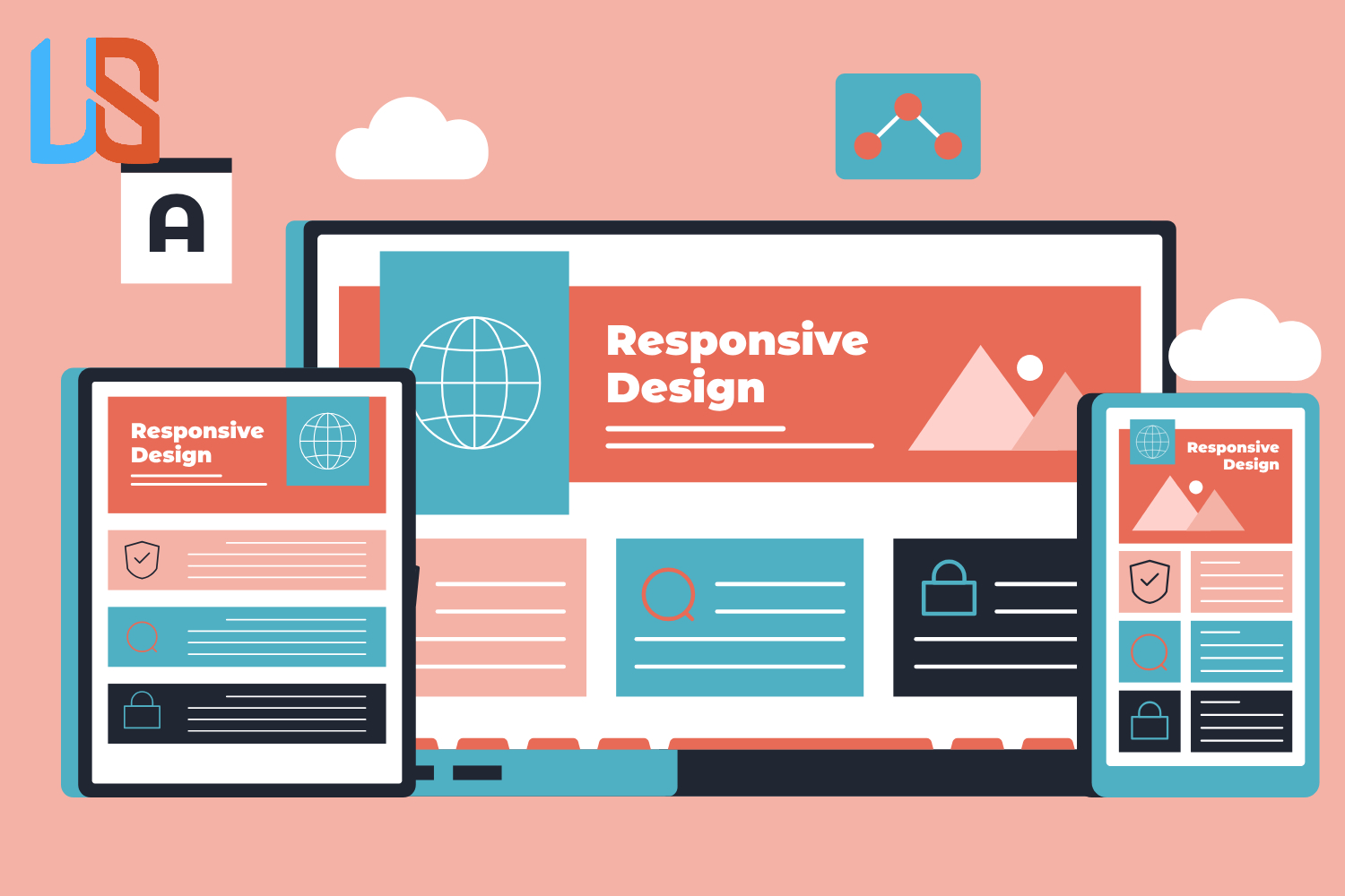
Responsive web design is an approach to website development that aims to create web pages that adapt and respond to the user’s device and screen size. It involves designing and coding a website in a way that ensures its layout, images, and other elements adjust automatically to provide an optimal experience. Whether viewed on a desktop, laptop, tablet, or smartphone, a responsively designed website ensures that the content remains easily accessible and visually appealing.
Enhancing User Experience
- Consistent User Interface: A responsive web design ensures that users have a consistent browsing experience, regardless of the device they are using. The layout, navigation, and functionality remain intact, providing familiarity and ease of use.
- Improved Accessibility: Responsive websites are accessible to a broader audience, including individuals with disabilities. By implementing responsive design techniques, websites can meet accessibility standards and accommodate users with different needs.
Mobile-Friendly Approach
- Mobile Traffic Growth: The use of mobile devices for browsing the internet has skyrocketed in recent years. A responsive web design enables businesses to cater to the ever-increasing mobile audience effectively.
- Google’s Mobile-First Indexing: Google, the leading search engine, now prioritizes mobile-friendly websites in its search results. Websites that are not optimized for mobile devices may experience a significant drop in visibility, leading to a loss of potential customers.
SEO Benefits
- Higher Search Engine Rankings: Search engines favor responsive websites because they provide a better user experience. With a responsive design, your website is more likely to rank higher in search engine results pages (SERPs), leading to increased organic traffic and visibility.
- Lower Bounce Rates: A responsive website ensures that users can easily navigate and consume content, reducing the chances of them leaving the site immediately. This lowers the bounce rate, a metric that indicates user engagement and can positively impact search engine rankings.
- Faster Page Load Times: Mobile users expect fast-loading websites. Responsive design optimizes the loading speed by adapting the content and layout to suit the user’s device. Faster page load times contribute to a better user experience and can improve SEO performance.
Cost-Effectiveness
- Single Website Maintenance: With a responsive web design, businesses only need to maintain and update one website. This eliminates the need for separate desktop and mobile versions, saving time and resources.
- Reduced Development Time: Developing a single responsive website is more efficient than building multiple versions for different devices. Responsive design streamlines the development process and allows businesses to launch their online presence faster.
FAQs
Responsive design focuses on adapting a website’s layout and content to different devices, while mobile apps are standalone applications developed specifically for mobile platforms.
You can use various online tools, such as Google’s Mobile-Friendly Test, to check the responsiveness of your website. These tools provide insights into how your site appears on different devices.
Yes, it is possible to convert an existing website into a responsive design. However, it may require significant modifications to the code and design structure. It is often more efficient to build a new responsive website from scratch.
Responsive design can actually improve website loading speed by optimizing the content and layout for different devices. This ensures that users can access the site quickly, regardless of their device.
No, responsive design is essential for all devices, including desktops, laptops, tablets, and smartphones. It ensures a consistent and optimal user experience across the entire range of devices.
Conclusion
Responsive web design is no longer an option but a necessity in today’s digital landscape. It ensures a seamless user experience, boosts SEO rankings, and contributes to overall business success. By investing in responsive design, businesses can effectively engage their audience across various devices and capitalize on the ever-growing mobile market.


